Creating a Button Widget *
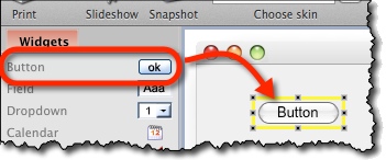
Find a Button icon on the left toolbar and drag it onto the screen:
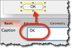
Change the text displayed on the button via “Caption” box on property panel:
Multiline Captions *
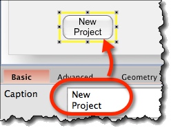
In “Caption” property, you can also enter multiple lines of text. They will be display as multiple lines on the button:
Icons on Buttons *
Buttons can have both an icon and a label. To choose an icon:
- Select the button.
- Use “Set Icon” option on the property panel:
![]()
Aligning Icon and Label *
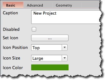
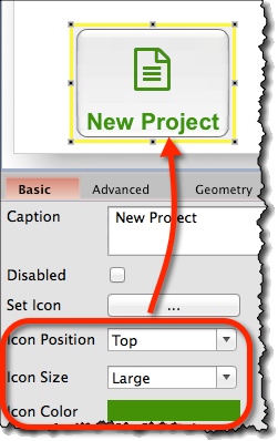
Icon options on the property panel:
- Icon can be positioned left, right, centred, top, or bottom.
- You can set icon size to small, regular, or large.
- You can set the icon’s color.
Button Widget Options *
Attributes specific for Button widget are:
- Caption (“Basic” tab) – Text to be displayed.
- Set Icon (“Basic” tab) – Icon to display on a button.
- Icon Position (“Basic” tab) – Default is left. It can be set to left, right, top, bottom, or center.
- Icon Color (“Basic” tab) – Opens color chooser to set icon’s color.
