- Creating a Table
- Define or Rename Table Columns
- Table Editor
- Edit Table Data
- Add More Columns and Rows
- Resizing Columns
- Add Buttons, Checkboxes, or Dropdowns
- Use Auto-Filling
- Copy-Paste Data from Excel
- Format Column Titles
- Formatting the Data in a Table
- Highlighting Table Rows
- Scrollbars, Gridlines
- Table Widget Options
Creating a Table *
Find a table icon on the left toolbar and drag it onto the screen:
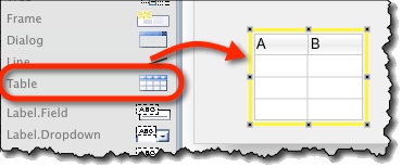
When new table is created, table editor opens automatically (you can close table editor by pressing the “Cancel” button). Note that:
- Table data is populated via table editor.
- Table columns are defined in the property panel, outside table editor.
Define or Rename Table Columns *
By default, new table has two columns: “A” and “B”. To rename table columns:
- Select the table.
- Specify the columns in the “Columns” box on the property panel:
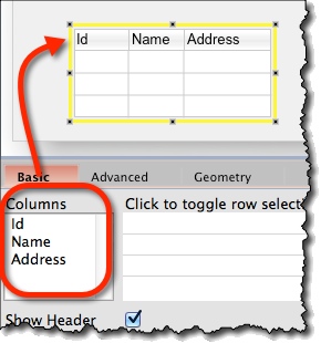
Table width is increased automatically to adjust to the column titles you specified.
Note:
- This approach is handy when you need just a quick empty table; you specify the columns from the property panel and you are done.
- When you need a column without a heading, add a dummy column by adding a blank ” ” title as a new column.
Table Editor *
In table editor, you can populate the table with data and format the table.
It opens automatically when new table is created. Otherwise, you can open the table editor by:
- Double-clicking the table.
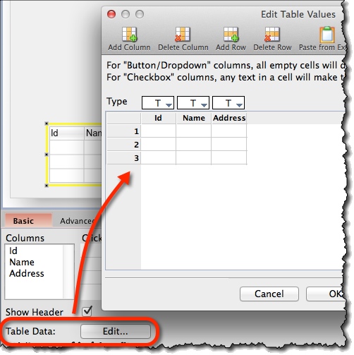
- Clicking the “Edit…” button (“Table Data” option) on property panel.
Edit Table Data *
To edit table data:
- Open Table editor.
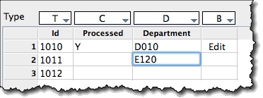
- Select a cell and start typing:
Add More Columns and Rows *
- Open the Table editor.
- Use Add/Delete Column and Add/Delete Row icons on the top toolbar.
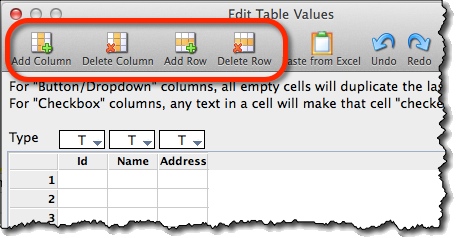
- If no column/row is selected, new column/row is appended to the end.
- If a column/row is selected, new column/row is inserted before it.
Resizing Columns *
To resize columns:
- Open Table editor.
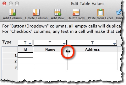
- Hover the mouse between column headings until the icon changes to resize indicator
- Drag the edge of the column:
Add Buttons, Checkboxes, or Dropdowns *
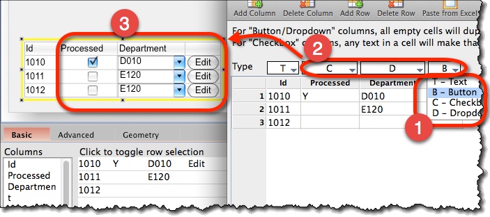
Table columns can be one of the following:
- Text
- Button
- Checkbox
- Dropdown
To change the column type:
- Open Table Editor.
- Adjust the “Type” dropdown above the column:
Note:
- For “Checkbox” type columns, the checkbox is ticked when the cell is non-empty.
Use Auto-Filling *
For “Dropdown” and “Button” type columns, any value will be automatically repeated within the same column.
This is handy for some situations:

Copy-Paste Data from Excel *
Quick way to enter data is to paste it from a spreadsheet.
To do that:
- Copy data from a spreadsheet (e.g. MS Excel).
- Open Table editor.
- Select the top-left cell where data will be pasted.
- Choose “Paste from Excel” from the top toolbar:
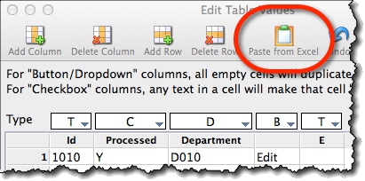
Note:
- Pasting will not add rows or columns automatically. You have to add appropriate number of rows and columns beforehand.
Format Column Titles *
To format column titles:
- Select a table.
- Use formatting icons from the top toolbar:
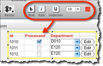
Formatting the Data in a Table *
To format a data in table cells, use the formatting icons on “Advanced” tab in property panel:
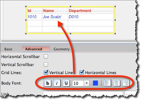
Note:
- You can format only the “Text” type columns.
Highlighting Table Rows *
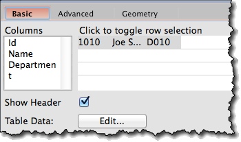
You can highlight rows in the table by selecting them in “Click to toggle row selection” table on property panel:
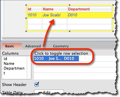
Notes:
- You can select multiple rows by Shift+click or Ctrl+click (Cmd+click) etc
- To deselect a row, click on it again
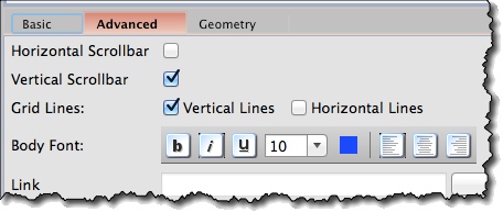
Scrollbars, Gridlines *
On “Advanced” tab in property panel, you can format the table look and feel further:
- You can turn on or off both horizontal and vertical gridlines.
- You can add scrollbars, both vertical and/or horizontal.
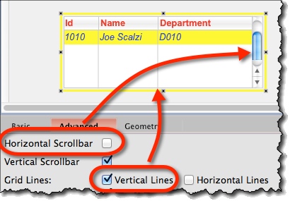
Table Widget Options *
Attributes specific for Table widget are:
- Columns (“Basic” tab) – Here, you add, delete, and rename table columns.
- Click to toggle row selection (“Basic” tab) – Select or deselect rows that will be selected.
- Show Header (“Basic” tab) – Whether or not to show the header row.
- Table Data (“Basic” tab) – Edit button opens Table editor.
- Horizontal and Vertical Scrollbar (“Advanced” tab) – Switches scrollbars on or off.
- Grid Lines (“Advanced” tab) – Switched on or off grid lines, either vertical or horizontal or both.
- Body Font (“Advanced” tab) – Here you can format table data.
