Creating a Checkbox Widget *
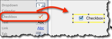
Find a Checkbox icon on the left toolbar and drag it onto the screen:

Ticking or Unticking the Checkbox *
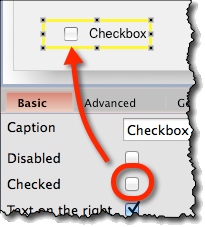
By default, the checkbox is ticked. You can change it by switching “Checked” property on the “Basic” property panel:

Changing Label Position *
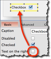
By default, the label is on the right. You can change it by switching on or off “Text on the right” checkbox on the “Basic” property panel:

Checkbox Widget Options *
Attributes specific for the Checkbox widget are:
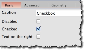
- Caption (“Basic” tab) – Text to be displayed as checkbox’ label.
- Checked (“Basic” tab) – Whether the checkbox is ticked or not.
- Text on the right (“Basic” tab) – Change whether checkbox’ label is to be displayed on the left or on the right.
